A selection of lovely old shop signs in and around the centre of Budapest:
Bruce Peter's Blog
Bruce recommends...
Thursday, 16 May 2013
Tuesday, 26 March 2013
The Odeon Cinema in Glasgow
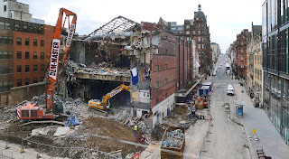
The sight of large numbers of Glaswegians stopping to gaze wistfully at the old Odeon cinema being demolished prompted me to have a little look in my photograph collection to see what images I could find of the building at various stages of its lengthy existence.
Designed by the London architectural practice of Verity and Beverley and opened on Hogmanay, 1934 as the Paramount Theatre, the building was sold to Odeon at the beginning of the Second World War. No doubt this was because the original owner, the American Paramount film studio feared that Britain would shortly be over-run and therefore wanted to get out of film exhibition here.
From most angles, the Odeon frankly was quite an ugly blot on the cityscape, the windowless dark red brick flank of which menaced its suppoundings and caused planning blight in the adjacent streets. Its frontage to Renfield Street, however, was quite a good example of mid-1930s 'moderne', which appeared to have little or no affinity with the great bulk of the auditorium and stage house. Although lacking visual integrity, from a commercial viewpoint, however, the building was a resounding success, being one of the busiest and most profitable cinemas in Britain.
The foyer appears to have been painted in strong colours - possibly orange and dark purple - with black and white formica panelling covering the 1930s stairtcase balustrades and white hexagonal boxes containing artificial plants on the walls. Hexagon and lozenge shapes were very popular in 1950s and 60s commercial design and were probably influenced the the work of the Festival of Britain's Festival Pattern Group. Odeon's rival cinema chain, ABC, even used lozenge shapes for the name signs on their cinemas in this period.

Designed by the London architectural practice of Verity and Beverley and opened on Hogmanay, 1934 as the Paramount Theatre, the building was sold to Odeon at the beginning of the Second World War. No doubt this was because the original owner, the American Paramount film studio feared that Britain would shortly be over-run and therefore wanted to get out of film exhibition here.
From most angles, the Odeon frankly was quite an ugly blot on the cityscape, the windowless dark red brick flank of which menaced its suppoundings and caused planning blight in the adjacent streets. Its frontage to Renfield Street, however, was quite a good example of mid-1930s 'moderne', which appeared to have little or no affinity with the great bulk of the auditorium and stage house. Although lacking visual integrity, from a commercial viewpoint, however, the building was a resounding success, being one of the busiest and most profitable cinemas in Britain.
The view from the new Forever 21 shop, across West Nile Street:
In December 1934, it was all so very different. The Paramount Theatre was one of the first buildings in Glasgow with neon outlining and floodlighting - and it must have looked sensational:
The interior was a very good example of the typical mid-1930s approach to the design of large premier cinemas, with Art Deco plasterwork, jazzy carpets, rattan chairs and potted palms. This is the balcony foyer:
The cafe and restaurant, facing Renfield Street:
The auditorium:
With wartime grime, at the point of sale to Odeon:
As the Odeon in the early-1950s:
Odeon staff in the foyer, the usherettes wearing tartan dresses and there are what appear to be clan shields on the wall behind:
The auditorium, overlaid with 'Festival of Britain' style wallpaper and lights:
The early-1960s, still with tram tracks outside, but with a new fluorecent-lit canopy:
The foyer and auditorium in 1962, following redecoration:
The foyer appears to have been painted in strong colours - possibly orange and dark purple - with black and white formica panelling covering the 1930s stairtcase balustrades and white hexagonal boxes containing artificial plants on the walls. Hexagon and lozenge shapes were very popular in 1950s and 60s commercial design and were probably influenced the the work of the Festival of Britain's Festival Pattern Group. Odeon's rival cinema chain, ABC, even used lozenge shapes for the name signs on their cinemas in this period.

The Odeon in the latter-1960s, by which time film shows were being supplemented with concerts. Johnny Cash, The Clancy Brothers, Count Basie and Georgie Fame are among the forthcoming acts:
The late-1960s, showing 'Prudence and the Pill', an X-rated sex comedy - a type of film unlikely to fill over 2,000 seats:
How the Odeon's interiors looked in 1968:
In 1970, the Odeon closed for a radical rebuilding into a new three-screen complex, the redesign by Dry Halaz Dixon Architects not only removing all trace of the original interior design, but also covering part of the exterior in grey corrugated steel sheeting:
A set of publicity photographs with posed models distributed to the press when the new Odeon Film Centre opened in October 1970:
Odeon 1, upstairs:
Odeon 2, beneath Odeon 1:
Odeon 3, in the former stage area, even had a small balcony:
The Odeon Film Centre in the latter-1970s: nothing can disguise the obvious characteristics of a botch-up:
The Odeon Film Centre in the early-1990s, by this point further subdivided into six screens and with the corrugated steel facia painted in multi-coloured stripes:
Odeon 1 remained very big and comfortable - a very good place to see a film:
Then, in the mid-1990s, there was another renovation, during which the frontage to Renfield Street was de-clad and restored to something like its original condition:
A new name sign being fitted:
The refurbished Odeon looked particularly impressive at night with blue neon and floodlighting:
March 2013 - and the Odeon undergoes demolition:
Subscribe to:
Comments (Atom)


